- Source: Exhibition Essay
- Author: Carolyn L. Kane
- Date: April 01, 2016
- Format: PRINT
Bridge Time
These days no one has time to wait.
These days no one has time to wait. Spare seconds, minutes, let alone half-hours and 45-minute sessions have become increasingly expensive in our high-speed, high-resolution, pay-per-download Wi-Fi culture. Everything must be NOW or it risks being at all. At least this is the ideology ushered in through e-commerce, mass media, and corporate capital.
But bridge time does exist. This is the in-between time that stitches together those almost imperceptible instants and forgotten thresholds of passing, segues, and crossovers. In the human world, bridge time is walking across the office, crossing the street, or waiting for someone to answer your call. In the world of computing, bridge time involves downloading, processing, saving, storing, encoding and decoding, transmission, and mass dissemination. In fact, there is a significantly grotesque amount of bridge time in the world of “high-speed” computation. Hi-tech industry may not want us to take much notice of the ubiquity of these in-between states, but they are there, and they are also the key to developing a richer understanding of ourselves and the culture we live in.
Marcel Duchamp identified the importance of such bridge time moments over a century ago, in his articulation of the “infrathin.” For Duchamp, the infrathin were states that, in the context of an artwork, invoked an immeasurable interstice between two ideas in constant transition or negotiation. Circa 2016, Los Angeles-based artist Michael Genovese has appropriated similar bridge time moments, illustrated in his recent series of paintings, Intervals, featured in his 2016 solo exhibition at the Moran Bondaroff gallery in West Hollywood, California.
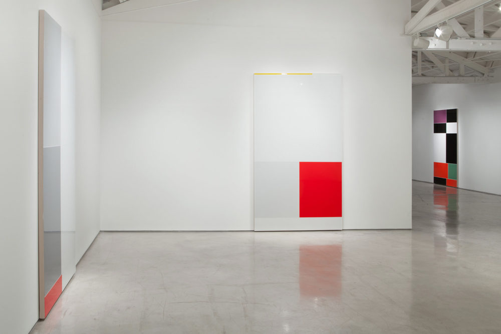
Installation view: Intervals (2016)
At first glance, Genovese’s large-scale Intervals appear to have nothing to do with ambivalence, uncertainty, or the threshold of conceptual space invoked by the infrathin. Rather, his clean-cut, precisely executed, unanimously square and rectangular shaped pictures seem to belong to the straightforward genre of traditional color field paintings, rendered according to the conventions of minimalism and the pre-established dictates of modern art. And yet, while they appear to sing this same well worn “song,” as the artist puts it, they do so using “a different story.” But what story of ambivalence or indecipherable uncertainty could static color field paintings have to tell, circa 2016?
Already the suggestion of a story with its correlative set of interpretive meanings wreaks havoc on the tradition of modern flatness and militant anti-signification. But the bigger breach comes with the artist’s color choices. Instead of the pure, primary hues favored by traditional color field painters, Genovese selects an offbeat set of hues running the gamut of pale blue, turquoise, muted magenta, burnt orange, and dirty yellow. The eclectic choices are especially evident in Interrupt (2016), Chasing After Wind 1 (2016), and Hichokshi (2015-2016) [Figures 1-3]. His color palette is not merely one step away from the red, yellow, blue, black, and white of a Mondrian, towards the sometimes secondary palette of blue-greens and red-oranges in a Rothko but instead a full-blown defiance of any color pairing principle from primary, secondary, and tertiary sets to tetratic, analogous, or simultaneous contrasts. In short, his palette offers no pre-established color order or system to classify it in. Moreover, in place of standard geometrically aligned rectangles and squares, neatly composed in a static grid (the modernist grid that Rosalind Krauss wrote so eloquently about), Genovese’s squares and rectangles are offset. Straight lines become bent corners and lines of sight fail to match up between color spaces. The sanctity of the grid is disturbed. Together, the combined effect of offbeat color and decentered squares begs the question, why are these colors and these misaligned rectangles, placed together in this agitated yet meticulously polished composition?
The story begins with a set of a screen grabs. Not just any set of screen grabs: 6,000 screen grabs captured by the artist from his iPhone interface while the operating system was in the process of executing an operation, retrieving data from the network to display on the iPhone. After entering a search term in the Google image query––sample queries employed single terms like “abandoned,” “elation,” “faith,” “pessimism,” “rage,” “guilt” or “astonished”––– the artist carefully captured a screen grab from the phone’s interface in the split second prior to it retrieving and rendering the full set of images from the database. What do these screen grabs reveal? Flat color fields loosely corresponding to the query. Red, pink, blue-green, and black appear for Rage; black, green, and orange appear for Guilt; an overwhelming amount of solid white with a dash of red appear for Elation; and light blue, white, and black fill the bridge time interval in the search for “Faith.”
But even so, while one may make the leap and connect to the data interval to the color field tradition, which Genovese obviously did, when considering an appropriate subject matter for a large-scale painting, one would typically move on to bigger and better material (a beautiful object, an awe-inspiring landscape or some other such thing). Even the name “screen grab” suggests something impermanent and passing, not the kind of well-poised subject matter or noteworthy venue that inspires hours of painstaking polishing, scraping, and sanding that Genovese’s paintings were subject to. Beginning with 12-oz German imported canvas stretched on an aluminum frame, Genovese next applied 10 layers of gesso to make the surface flat after which he applied a single stage of polyurethane color. After drying, the image was further submitted to extensive sanding, polishing, and related techniques to make the surface appear “almost perfect” in its flat cold finish. The resultant surface is delicate ––“one tap of a corner,” he explains, “and it’s over.” And yet, these seemingly inconsequential networked data intervals formed the fleeting moments that captured and sustained Genovese’s attention. Prolonged attention to nowhere instants of nothing in particular is far from the norm in the history of painting.
In the world of photography, things are different. The ephemerality of a passing moment is this medium’s stock and trade. The photographic camera can capture in a fraction of an instant a slice of life that in many ways remains off-limits to human perception. When the medium was introduced at the beginning of the last century, it posed a series of challenges to painting with its long-held hegemony on the aesthetic of sublime beauty and form. Photography spoke instead to a new sensibility rooted in speed and the massive changes brought about through modernity, urbanization, and the industrialization of culture through machine and industry.
German critical theorist Walter Benjamin captured the essence of the new machine aesthetic of cinema and photography in 1936 when he described the camera’s capacity to open up a different sort of nature than the one available to the “naked eye.” In photography, he explained, an Unconsciously penetrated space is substituted for a space consciously explored…Even if one has a general knowledge of the way people walk, one knows nothing of a person’s posture during the fractional second of a stride. The act of reaching for a lighter or a spoon is familiar routine, yet we hardly know what really goes on between hand and metal, not to mention how this fluctuates with our moods.
The new photographic media so spectacularly excelled in capturing the ephemeral moment that pioneering French photographer Henri Cartier-Bresson termed the phrase, the “decisive moment.” He had in mind that single ephemeral and escaping moment when something could be caught by the eye of the camera and preserved through history. First published in his book “Images on the Run,” Cartier-Bresson’s notion of the decisive moment shaped some of his most important work, including the notorious Place de l’Europe (1932), depicting a man about to land into a puddle of water, and The Val de Marne ‘departement’ (1938), an image of a newly-wed bride and groom at their wedding party in Joinville-le-Pont, near Paris.
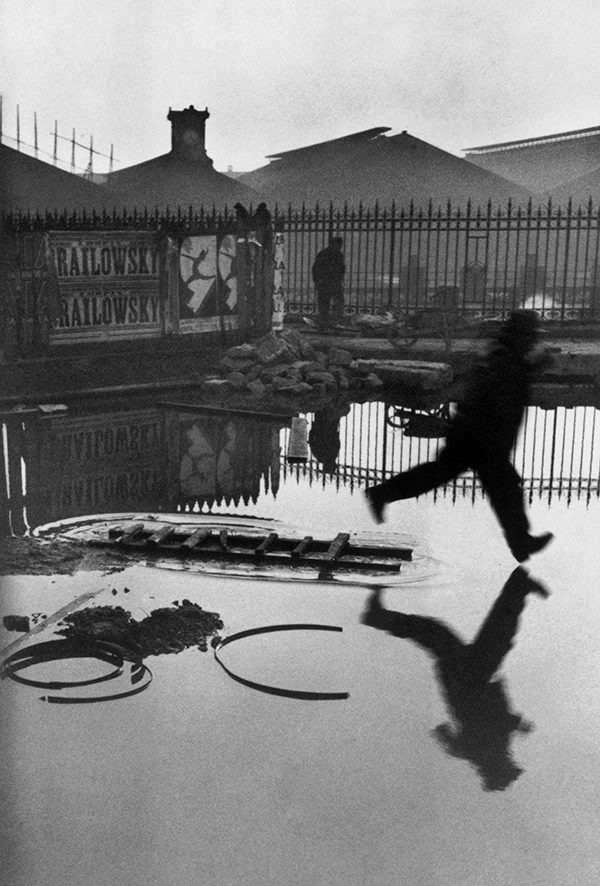
Henri Cartier-Bresson, Place De L'Europe, Gare Saint Lazare, Paris (1932)
Cartier-Bresson describes the invaluable fractional-moment:
There is a creative fraction of a second when you are taking a picture. Your eye must see a composition or an expression that life itself offers you, and you must know with intuition when to click the camera. That is the moment the photographer is creative. Oops! The moment! Once you miss it, it is gone forever. His concept of the decisive moment has remained close to the history and practice of art, documentary, and journalistic photography throughout the twentieth century through the present.
One may be tempted to classify Genovese’s screen grab Intervals as just such Decisive Moments, but this would be a mistake. Things have changed in an era of Instagram and Pinterest. Decisive moments are no longer the exclusive domain of the sensational or rare spectacular event. Today, any moment or thing can become decisive (as trend, fashion, crowd sourced, etc.) provided it is supported through the appropriate media channels and public platform. And as is also well known, such instants die out as quickly as they are made. Easy come easy go. And this is precisely what Genovese has brought into focus by transforming a set of exceedingly banal passing moments––moments not meant to be noted let alone reflected on–––into frozen and static paintings, immortalized in time. Put differently, by aestheticizing the most vernacular slice of the infrathin, Genovese brings into resolution the pervasive ways in which our high-speed culture privileges nothing and values reflection even less. As artists, thinkers, or cultural producers, it is our responsibility to reevaluate such cultural throwaways, even if only to restore a much-needed pause in the nonstop march to greater and greater acceleration.
Carolyn L. Kane is the author of Chromatic Algorithms: Synthetic Color, Computer Art, and Aesthetics after Code (University of Chicago Press, 2014), an award-winning book analyzing the role of electronic color in the development of media aesthetics 1960. After completing her Ph.D. at New York University and a Postdoc at Brown University, she joined the Faculty of Communication and Design at Ryerson University in Toronto.
