- Source: VOGUE
- Author: MADELEINE LUCKEL
- Date: MARCH 17, 2017
- Format: ONLINE
The Whitney Biennial Is Brimming With Design-Minded Works

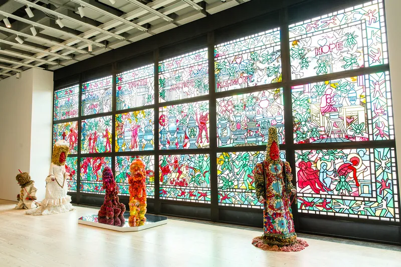
Installation view of Raúl De Nieves, beginning & the end neither & the otherwise betwixt & between the end is the beginning & the end, 2016.
Today, the Whitney Museum of American Art opens its 78th biennial exhibition. The exhibition, which is the oldest of its kind in the U.S., has been receiving positive reviews all week. It is the first such show in the museum’s new Chelsea location, and is also the first time that the biennial has been curated by two people of color. Understandably, much has been made of the exhibition’s timing in terms of the new Trump administration. But while the biennial does indeed have its political pieces, it does not come off as overwhelmingly tethered to current events.
The more surprising thematic current is perhaps the repeated presence of design-informed works. You see it in Jessi Reaves’s modernist furniture, namely, in an Eames Herman Miller sofa, which has been swathed in a translucent pink silk slipcover. You see it too in Samara Golden’s uneasy interiors-geared installation, and in Chemi Rosado-Seijo’s off-site installation in a classroom of the Lower Manhattan Arts Academy. It’s there again in Aliza Nisenbaum’s painting, La Talaverita, Sunday Morning NY Times. Nisenbaum’s painting is a work which deals with the lives of undocumented immigrants, and one can’t help but imagine that the colorful backdrop depicted (majolica tiles?) is a nod to the two figures’ heritage. But it is Raúl de Nieves’s work that deals most memorably with design, tackling the discipline—among other things—with a stained-glass wall.
The wall, which is visible from the street as well, is part of a larger installation which incorporates a series of sculptural figures. However in de Nieves’s revitalization of a medium that is often associated with medieval churches, he creates a piece that pushes not only the boundaries of art, but also those of craft and design. The panels incorporate wood, beads, glue, and tape among other materials, thereby widening what can be traditionally seen as an example of stained glass. The scenes depicted, which stretch from floor to ceiling in a grid-like formation, center on a fly. A larger metaphor, yes, but look too for instances where the act of making is directly depicted. Fitting, one could argue, for any art exhibition. Then again, this isn’t just any art exhibition. So what’s behind this confluence of pieces, which together seem to make an argument for the resurgent presence of design in contemporary art today? Yes, the fact that this show is taking place in the Whitney’s dazzling new Renzo Piano–designed building is likely not besides the point. But perhaps, too, there is a renewed interest in examining a broader sweep of what constitutes art. Breaking down boundaries, and showing a diverse set of viewpoints. That is, after all, what the Whitney’s biennial has always been about.

