- Source: The Brooklyn Rail
- Author: Daniel Gerwin
- Date: March 07, 2019
- Format: DIGITAL
Keltie Ferris: RELIEF
Morán Morán | February 15 – March 20, 2019
“My paintings used to be dense and layered, and lately I’m separating out the parts.” This was Keltie Ferris’s remark in a September 2015 interview with Jason Stopa about her exhibition that year with Mitchell-Innes & Nash. Compared to her current show at Morán Morán, those 2015 paintings were positively overflowing. In Ferris’s newest work she has further pared down her visual vocabulary, resulting in paintings that—for her—are remarkably spare. In addition, and also unlike her previous work, Ferris’s new paintings are highly methodical. These observations are not complaints (though devotees of her earlier work may find the changes jarring), but rather notes through which to open an inquiry into the new course Ferris is charting.
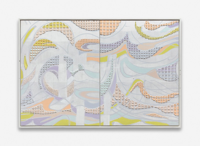
RELIEF consists of seven works constructed in two basic layers: the first layer, painted thinly onto the canvas, involves curving gestural lines (usually in powdered black graphite which sparkles from various angles) that create interstitial shapes which Ferris selectively and sensitively fills in with color. These elements are complicated by smeary wipe marks she makes using a rag, in the manner of Christopher Wool. The second layer is comprised by filling additional shapes with color, but this time the paint is a thick frosting, often applied as a grid of small tiles created by mixing paint with marble dust and slathering it over a foam-core stencil that Ferris hand cuts, lays down on the canvas, then lifts off to create chunks of color. This move is not rare among abstract painters lately, but Ferris deploys it to her own ends. Finally, she has painted the pictures’ wood frames with one or more colors from the palette on the canvas, producing a discreet halo of color around the image within.
Keltie Ferris, Hydra, 2019. Oil and Acrylic on canvas in artist's frame. 82 x 62 x 3 inches. Courtesy the artist and Morán Morán
In three of the paintings, Hydra, L*I*L*L*I*E*S, and River Run (all 2019), the palette is reduced to a narrow value range of pale tints and grays, with the thickly stenciled layer containing more saturated hues that remain in a pastel range in the first two paintings, but include more vivid blues in the third. The ground hues in L*I*L*L*I*E*S are so thoroughly desaturated that the impasto tiles, despite their mild palette, pop optically against them. In Color Radio (2019), KEB + FZF (2019), River Run (2019), and RELIEF (2018), the playful loops, curves, and circles of line create a Dionysian dance, interrupted and resisted by wipe marks which are done horizontally or vertically to impose the Apollonian discipline of the grid, like a police officer breaking up a party. Color Radio (2019) contains less obvious, internal rectilinear divisions, making a subtle substructure. The tension between fluidity and rigid structure animates these paintings, and the union of these binaries links Ferris’s new work to her past oeuvre. She built her reputation on forcing together systematic moves with impromptu mark making until each painting reached a crescendo of cognitive dissonance and intense color. These newest paintings contain the same pressurized blend, but in much more distilled and quieter iterations than the paintings for which she became known.
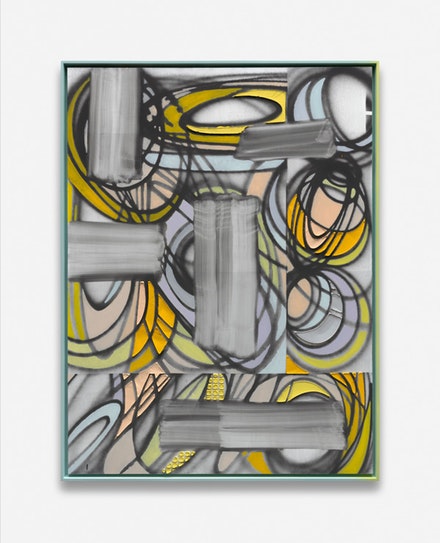
Keltie Ferris, Color Radio, 2019. Oil and Acrylic on canvas in artist's frame. 82 x 62 x 3 inches. Courtesy the artist and Morán Morán
Which brings us to the title of this exhibit: RELIEF implies contradiction from the outset. Ferris explained to me that on a material level, she is interested in turning the ethereality of hue into sculptural substance. Optically, her new work departs from the cacophonies of her older paintings, which for some may provide visual relief, a notion that is complicated by the fact that the title is written in strikethrough. The 2018 painting that shares the show’s title is made of two panels, the second and smaller panel mounted directly on top of the first. Standing in front of the painting the two layers dissolve into one, but one step to the side reveals the double strata. The marshmallow-like raised chunks of color perform a similar trick: they can disappear when viewed straight on, especially from more than a few feet away, but become obvious from a raking angle. Even more striking is the way these impasto passages fade into deep space when they are upstaged by strong black and white contrasts, as in KEB + FZF. Ferris appears to be playing with conventions of bas-relief sculpture, using painting’s illusionism to turn sculptural norms inside out.
Ferris’s innovations are in some way attuned to our historical moment. She told me she began these changes at the time of Trump’s election, and she considers those first efforts to be dark in mood. Sink/Swim (2016) is a case in point: though at barely three feet tall it is small for Ferris, its turbulence threatens to swamp the viewer. As this body of work has developed, it suggests interest in language that is at once deceptive and emphatically real. This focus might be understood in relation to a president who relies on falsehood, but step outside his rhetoric and the lies are obvious. On a deeper cultural level, Ferris’s melded oppositions speak to the evolving blur of long-treasured binaries such as masculine/feminine, or straight/gay. Ferris is probably not thinking directly about any of this in the studio, but her pictorial evolutions, rewarding in their own right, nevertheless serve as signposts worthy of consideration.
