- Source: Hyperallergic
- Author: Cat Weaver
- Date: June 24, 2014
- Format: DIGITAL
MoMA’s Postconceptual Curators
Recent Acquisitions
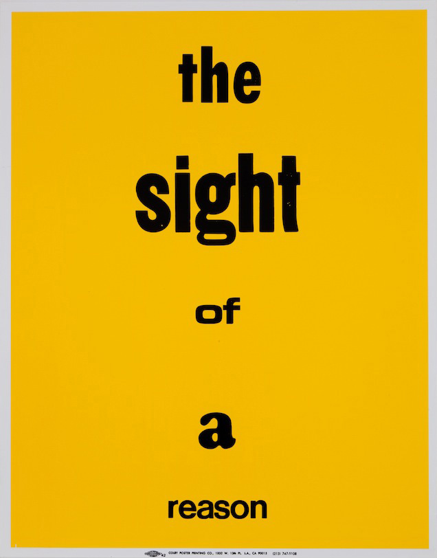
Eve Fowler, “A Spectacle and Nothing Strange” (2011–). Set of twenty one letterpress posters. Sheet: 28 × 22″ (71.1 × 55.9 cm)
(Image courtesy The Museum of Modern Art Library)
Ever since 2009, when the Museum of Modern Art (MoMA) expanded its Department of Media to include performance art (it is now the Department of Media and Performance Art), it has been both praised and criticized for its focus on acquiring transdisciplinary and postconceptual work that is often ephemeral, like sets of instructions passed on by word of mouth — things that belong to everyone.
A new show of MoMA’s recent acquisitions, Sites of Reason, displays works which blend disciplines and media and challenge the curators to build the art in situ. It provided an opportunity to examine some of the more interesting aspects of contemporary curation.
So I sought out an interview with curators David Platzker and Erica Papernik in order to gain some insight into what is involved in acquiring time-based and transdisciplinary art. Platzker, who’s been with MoMA for only one year (following his stint as founder and president of the project space/bookstore Specific Object), is curator in the Department of Drawings and Prints, while Papernik has been assistant curator in the Department of Media and Performance Art since 2010. They worked closely together and with the artists to develop Sites of Reason.
We began with A Spectacle and Nothing Strange, a series of 21 wall of posters created by the American artist Eve Fowler.
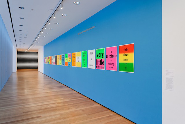
Installation view of ‘Sites of Reason: A Selection of Recent Acquisitions’, The Museum of Modern Art, June 11–September 28, 2014.
(©2014 The Museum of Modern Art, New York. Photograph: Thomas Griesel)
Cat Weaver: Since these posters could be mass-produced, when you acquire them are you buying them as one would buy a work that comes in an edition? I know they’re an ongoing project as well, which is another part of my question: will MoMA continue to acquire these as the project continues?
David Platzker: Lets talk initially about the production. Eve Fowler worked with a commercial printer in Los Angeles that has, for 60 years, been producing commercial posters.
If you went on a drive through Los Angeles, you’d see telephone poles with posters advertising cheap loans, hair care products, garage sales, sporting events, musical events— they were, more often than not, produced by Colby Poster Printing Company.
And many artists over the years have worked with this printer, because they were cheap and easy. They had plaques with different colors behind it and you could either go in and say, “Just make it for me.” Or you could customize it with an unlimited number of typographies.
CW: I was going to ask about that. Because it does seem like it’s using all Helvetica, or something like it.
Erica Papernik: It is actually random. She gave them specific instructions to use a random combination of colors and letters.
CW: So it could have been more contrived, but she wanted them less contrived.
DP: Yes. So she did this with the intention of its being an open edition, in the sense that you’d go into the print shop and you’d say, “I’m going to start with a certain number of them, print them up for me.”
CW: Right, okay. So the new ones will also be printed by Colby?
DP: Unfortunately Colby Poster went out of business.
So technically the edition is done because no more can be printed by Colby.
CW: So that gives them some added value.
DP: And one could buy these either as a complete unit, or individually. You can actually go to the artist’s website and buy a single panel. I think it’s $250 per piece and you could pick and choose which piece you’d want.
EP: So to just kind of back up for one second, just about the randomness, I think, the way I interpret her desire for random combinations of colors and text style, is that, as David said, the Colby Posters were used as cheap advertisements posted all over L.A, they became a recognizable part of L.A city landscape. So I think, partly by doing them in all these kind of random combinations is that they are kind of adopting that vocabulary that’s like a form of street advertising. And she puts them in all these places all over the city. They didn’t have to have to same design.
Then the text came from Gertrude Stein’s Tender Buttons and How to Write. Specifically ‘The sight of a reason,’ which is the phrase that we adapted the title from, is from Tender Buttons. But other phrases are from How to Write as well.
CW: Right. And apparently Gertrude Stein’s approach was that she was dealing, in Tender Buttons, with descriptions of everyday objects and she’s giving them this new resonance. And I think the posters kind of layer that quotidian resonance.
EP: Exactly. Basically this work is, I think, echoing what Gertrude Stein was doing with language — kind of a nice layering.
CW: Now this is an ongoing thing, so is she going to be using a different printer and is MoMA going to acquire them?
EP: My sense is it’s ongoing in that she may still display posters in other places, and it may still be exhibited, that’s my understanding. But it would be a great question for her certainly if she plans to continue with it in some other regard
CW: So how will MoMA display this particular work in future? Is this a permanent placement for it or will it move around, or will it go in and out of storage?
EP: Well, this piece was actually acquired by our library. The library bought a copy, which is still physically in there. And then we bought a second copy for the purpose of this exhibition.
DP: The reason why we did that is that this wall gets a huge amount of light and these are going to fade out over time. And since the artist herself displays them in natural light situations where they can get used and abused, we wanted to play with that.
CW: So this will stay up and it will fade and change like the ones Eve Fowler places in the streets.
DP: Yes. This will stay through to the end of the exhibition and we’ll put it into storage. Then when we do another show in the future, whoever the curators are can make a decision if they want to use this particular version. The good thing with this particular set, is they could show only a few panels if they like. There’s no order, so it doesn’t have to be done in a straight line; you can mix and match them. So the artist gives the curator pretty much ultimate freedom to activate the piece however one sees fit.
CW: And she was here to help you plan out how to place these?
DP: We brought her in to discuss the color of the wall, and to discuss the various possibilities with the windows and the placement.
CW: Yeah, that wall color (a vibrant shade of teal, to my memory) would have been an issue.
DP: Yes. So it was about how we wanted to present them— and obviously on a bright day like today, you can see the beautiful echoing off of the sun.
CW: So I wanted to ask you, David, in particular — because of your background with Specific Objects — I thought maybe you have a penchant for word art and for printed matter?
DP: I wouldn’t say so — certainly for printed, not necessarily for word art — I’m interested in artists who use publishing as a means of distribution.
CW: Is that going to be an ongoing theme of your curatorial acquisitions?
DP: Not necessarily. For instance right now I have another show up about John Cage and there is really no echo of that going on within that show. I think one of the beauties of being curator here is you’re open to all sorts of possibilities. Publishing is a very big part of where my head comes from, but it’s not the only thing that I can do.
CW: This show is billed as focusing on “recent acquisitions” — so are these newly acquired —in the past, say, year or two? Did you acquire them?
DP: Oh no. This is just a very, very small selection of a very large number of pieces. And the majority of these pieces in this show were acquired over the last three years.
CW: So they weren’t all acquired by you and Erica?
DP: No, we have works from Video and Film, Painting and Sculpture … there five departments represented in this exhibition, many of them being from media performance art, some being from drawings and prints, and this Fowler’s work is in the library’s collection.
CW: Now I’ve noticed that Peter Downsbrough is very heavily represented in this show. Why is that?
DP: There are some historic pairings or relationships that we wanted to play out. And one of the relationships that we particularly like is Peter Downsbrough with Liz Deschenes. How they each address space.
So these (the Downsbrough’s) are actually just three pieces, we have these two drawings which are one piece, and these two drawings which are another and then the two sculptures, which are another one. And then there’s a fourth element in the garden.
CW: Yes, I saw the photo of that last night on twitter. It took some time to figure out which piece you had photographed.
DP: Yes. Peter talks about how he’s not really a minimalist or conceptualist artist: he’s a maximalist. He loves this idea that he, by making these very slight interventions into either a drawing or a divisible space, is actually taking in everything that surrounds it. So the two poles in this room, are about re-framing, not only the physical structure of that space that it resides in, but also by drawing in everything that surrounds it as well — providing a framework for how we look at that environment. It’s even more dramatic to think of the two pipes in the garden where you really sort of frame in a much broader expanse.
EP: And we kind of felt Liz’s piece was a counterpart.
Liz Deschenes, “Tilt/Swing (360 º field of vision, version 1)” (2009). Black and white photograms mounted on metal, 136 x 192 x 58″ (345.4 x 487.7 x 147.3 cm),
original installation room dimensions 206 x 192 x 216″ (523.2 x 487.7 x 548.6 cm)
CW: Maddening to try to photograph. Absolutely maddening. The people on either side keep trying to get out of each other’s way, or not be in the pictures, so it’s very hard. It makes it like a game that I don’t know if Liz Deschenes was ever aware of. It becomes a kind of cat and mouse trying to get a picture.
DP: She’s aware of it! We were talking about how best to image the piece for our own purposes and how difficult it was going to be.
EP: And you’re aware this piece is actually inspired by 1935 drawing?
CW: No, I was not.
EP: By Herbert Bayer? So Bayer was a Bauhaus-trained graphic designer, architect, and exhibition designer; he actually designed the 1938 Bauhaus Exhibition that took place at MoMA. He did a drawing with the same title (Tilt/Swing 360 º field of vision) where he basically created a diagram for 350 degree extended vision. So instead of encountering a painting on a wall in an exhibition, you could see work on the ceiling, on the floor all sorts of places within the room. And what Liz has done is basically expanded that idea or translated it into physical form giving it a new life.
CW: To kind of realize it.
EP: It’s like a solution, yeah. Of course there are many differences, but she, in her work, is exploring different photographic processes and forms of image making. And these are photograms so they’re made without a camera. They’re made by exposing photosensitive paper to the night sky. The light that created what you see here is just simply from the moon, the stars, and artificial light from the surrounding buildings.
DP: There’s no lens in it.
EP: Exactly. As a result we have these kind of cloudy yet reflective surfaces that reflect the surrounding environments back into the work.
And in turn, what’s in the work is reflected back out onto the architecture in the space. And as well, the work accumulates physical traces of its physical environment. So with changing atmosphere, conditions in the room, eventually one will start to see slight changes in the surface.
So it’s kind of a counter point to the Downsbrough which remains unchanged and forces you to think about the environment around you. With a sense the piece absorbs it’s surroundings.
CW: [Referring to the Downsbrough sculptures] I was saying to someone, that my husband would immediately walk right into those dowels and snap them off.
DP: Thankfully it’s literally just two dowel rods.
CW: Yeah, easy to put up and … But if it were broken would it be considered a new piece when it was reinstalled?
DP: We literally just went out and bought dowels. We own the specifications to the work and the right to execute the work; we go out and buy the dowels to meet the specifications of the design.
CW: Like a Sol LeWitt.
DP: It can be done in a different space, it can be done on higher ceilings, lower ceilings. As long as the articulation between the two structures is defined.
CW: And he’s specified the space between them?
DP: The space between, the diameter of the dowel, the inter-lap, overlap between the two dowels.
CW: Right, so that’s another thing that I think MoMA is doing: examining how to acquire things that are not quite tangible. You’re not acquiring the objects so much as the idea, the concept. Although Downsbrough doesn’t consider himself a conceptual artist. The idea that you have instructions is similar.
DP: That’s happened also in the Cage Show downstairs where we’ve installed a Lawrence Weiner piece which is Gloss white lacquer, sprayed for 2 minutes at 40lb pressure directly. So the piece is the instructions, or the text, for describing the realization of the piece. How one executes the piece is open to the chance operation that determines it.
We move on to Emily Roysdon’s Sense and Sense.
Emily Roysdon, “Sense and Sense” (2010). Two-channel video (color, silent). 15:25 min. The Museum of Modern Art Library
CW: And now I wanted to talk about this because I think MoMA, along with other institutions that are dealing with postconceptual art, has been reaching out and trying to acquire more time based art.
EP: We have a department in media and performance arts.
So we are generally collecting work, most of the performance-based pieces in the collection are acquired through the department of media and performance art. And Emily Roysdon is a great example of an artist who’s working with a very hybrid practice. She’s making art, she’s doing choreography, she writing, curating, organizing –
CW: A lot of the artists here are doing that now: it seems to be a growing theme.
EP: Yeah, so I think it’s kind of indicative of a lot of contemporary practices. Transcending the boundaries of genre.
CW: I think that art, since the 80s I guess, has become more and more collaborative and interdisciplinary.
EP: This is true.
DP: Likewise two of the pieces in this show are large scale drawing installations that incorporate media, for example this Charles Gaines’s piece was actually in a joint acquisition between both of our departments. So the drawings and the video are one piece, yet we brought it in through two departments. Similarly, the Matt Mullican was acquired by the Department of Drawings and Prints, yet it incorporates a video component within.

Charles Gaines, “MANIFESTOS 2” (2013) Four-channel video (color, sound; 64 min.) and four graphite drawings on paper.
Acquired through the generosity of Jill and Peter Kraus, Jerry I. Speyer and Katherine G. Farley, and the Friends of Education of The Museum of Modern Art.
CW: It must be very exciting when you get to work together and see reflections between the traditional genres. And this is a perfect show I think for what’s going on at MoMA and what’s new.
DP: It was so much fun to reach out to other departments and say, “What have you got?”
CW: About acquiring time-based art, I mean this is a video and that’s very simple to think about. But sometimes you have performance pieces that are harder to acquire because they’re not video in fact sometimes the artists have requested that they not be videoed like Tino Seghal’s Kiss (acquired in 2009) which was acquired under Klaus Biesenbach.
EP: There are different sets of problems for each artist.
CW: It’s about preservation and display, no?
EP: Yes. We have a media conservation team now within the conservation department. So Kiss was acquired when Klaus was the curator of media and performance art. The chief curator now is Stuart Comer.
All the pieces here are acquired after Stuart’s arrival. In terms of media preservation we need to have an archival format of the work from which we can make copies for exhibition, so what you see here is not just the work. It’s an exhibition copy file created from the archival format which will last indefinitely. With performance it’s a whole other story and depends on each artist and the sets of concerns presented by each work. So it’s always arranged with the artists.
CW: So it’s about collaboration?
EP: In general, yeah, it’s also mainly documentation. It’s documentation of the topical history, how the work was made, so if we were talking about acquiring performance it would be whether it would be actual instructions for the performance, how long should it last, documentation of instructions and specifications. And then for the video it’s mainly how it was made.
Sites of Reason: A Selection of Recent Acquisitions continues at the Museum of Modern Art (11 W 53rd St, Midtown, Manhattan) through September 28.
